


This guest blog post was written by Diane B. Hogan, PhD, Technical Communications Specialist at ReDactions.
What is Document Design?
Document design is the process of combining words, visuals, and structure to create content that is not only informative but also easy to read, navigate, and understand. It goes beyond aesthetics, focusing on clarity, usability, and accessibility so that readers can quickly achieve their goals. In essence, strong document design ensures that form and function work together to communicate effectively.
This article highlights essential factors technical writers should consider when putting together their documents. Statistics noted in this article are from Karen A. Schriver’s book Dynamics in Document Design. My objective is to impart a bit of insight and wisdom for your next document design project.
Before we delve into some details of effective document design, let’s name and define it. Some of the terms we might use when naming the field are information design and communications design. However, I like Schriver’s (Schriver, 1997) designation because it rings true with my experiences. She selected document design as her label because it “suggests the act of writing and designing—the process of bringing together words and pictures” (p. 10). Additionally, she shares that the term conveys the complexities of the field, where the “organization and format of a document may be just as important as its language” (p. 10). Schriver stated, “Document design is the field concerned with creating texts (broadly defined) that integrate words and pictures in ways that help people to achieve their specific goals for using texts at home, school, or work. The reader’s needs should drive design activity” (p. 10-11). Indeed! Writers must be able to think verbally as well as visually.
No matter your preferred terminology, our objective as technical communicators, writers, and authors is to solve a problem for the user. A good design is not just about physical appearance. The designer must organize content into a logical and usable structure that is receptive to the user. The textual content must mesh with the design. Any design lives and dies by the content that it imparts (Schriver, 1997). Therefore, your document design should enhance readability.
From my perspective, the critical factors of effective document design are typography, layout, and visuals. Including illustrations in technical documentation to break up your text is beneficial, however, balance is also crucial because you do not want the visual display to obscure the message.
Typography and Space
“Typography is the art and technique of arranging type to make written language legible, readable, and appealing when displayed” (https://en.wikipedia.org/wiki/Typography). With this definition in mind, have you considered how your design helps the reader see the text? What do I mean by see the text? Consider highway road signs. The text must be easy to read in a short amount of time, especially if you are looking for a specific exit or street name.
Typography can evoke emotions and personality, helping you design effective documentation. So, what do you want the user to feel? I like to use Lato for headings and Segoe UI for paragraphs. For me, these fonts evoke a bit of lightness, technical savvy and add a welcoming feel, encouraging users to linger a while and learn.
Additionally, consider contrast, such as upper and lowercase letters. Contrast (light, medium, bold, extra bold, black) attracts users more than a serif or sans serif font. However, studies show that most people prefer sans serif type when reading online (Schriver, 2016). Also, consider that text set in all caps slows down reading from 13 to 20 percent. Use italic sparingly because italic phrases can also slow down a reader (Schriver, 1997).
The typography can set a tone or mood for the content. Often subtle, each element exudes a psychological influence over the reader. Schriver (1997) stated so eloquently that “Document design fuses art and science” (p. 11); it connects the reader by melding text, graphics, and typography into meaning that goes beyond text. When choosing a font, consider that it directly plays a role in reader engagement and interpretation of the content.
Typography and whitespace help readers see the text.
It optimizes readability.
HTML5 Output and Line Length
Line length is also vital to readability. Consider that users may have wide monitors. It is not easy to read across a wide monitor. Your eyes need a break at some point. To prevent the text from spanning the width of the screen, I set the topic width on the Flare master page as: <div class=”topicwidth”> and in the stylesheet: div.topicwidth { width: 75%; }. This setting defines the width as a percentage of the containing block. Therefore, the width of the line can grow and shrink to accommodate the monitor width.
Layout: Headings and Spatial Cues
Headings are your first opportunity to attract and keep the reader moving through your technical documentation. When users search for information, they are looking for concrete keywords that match their goals. For example, compare these headings: View Management versus Managing Views to Control Tasks. Adding a benefit or reason to the heading provides the user with a mental model of how the content can help them accomplish a task.
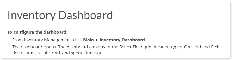
Follow the heading with a minimum of one sentence before you proceed to a sub-heading. Why do this? A break between headings lets the reader pause and absorb the content. I try to add at least one sentence between the H1 and the introduction to a procedure.
In the following example, notice that there is no introductory paragraph–no break for the eye.
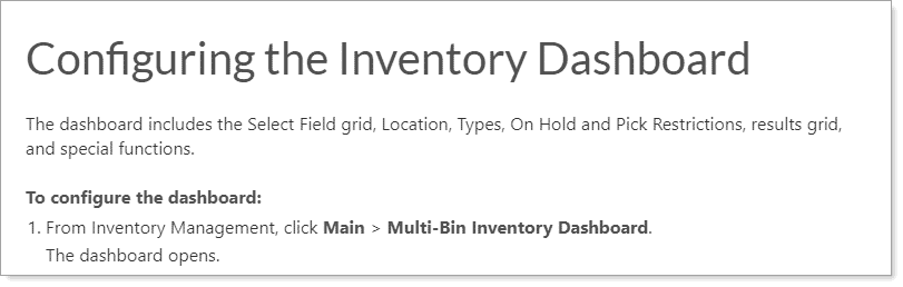
Now compare the revised version. It provides just enough pause for the reader to absorb the meaning and move to the next sub-heading. And the revised H1 may better match what the user needs. It reflects an action–configuring.
I recommend that you avoid headings that offer no follow-on paragraph, such as placing an H2 directly following an H1. Add a paragraph between the headings to guide the user.
Layout: Text and Graphics
The layout of your technical documentation is the physical arrangement of text and graphics. Additionally, “the layout must provide perceptual clues that enable users to process information. Users interpret layout before they begin the cognitive tasks of reading, remembering, and understanding” (Coe, 1996, p. 262).
According to Marlana Coe (1996), use the following universal truths when designing content:
- The most natural movement for the eye is from the upper left corner to the lower right corner.
- Graphical design elements and color attract the eye.
- White space, font, position, descending font size, and sometimes font family delineate hierarchy.
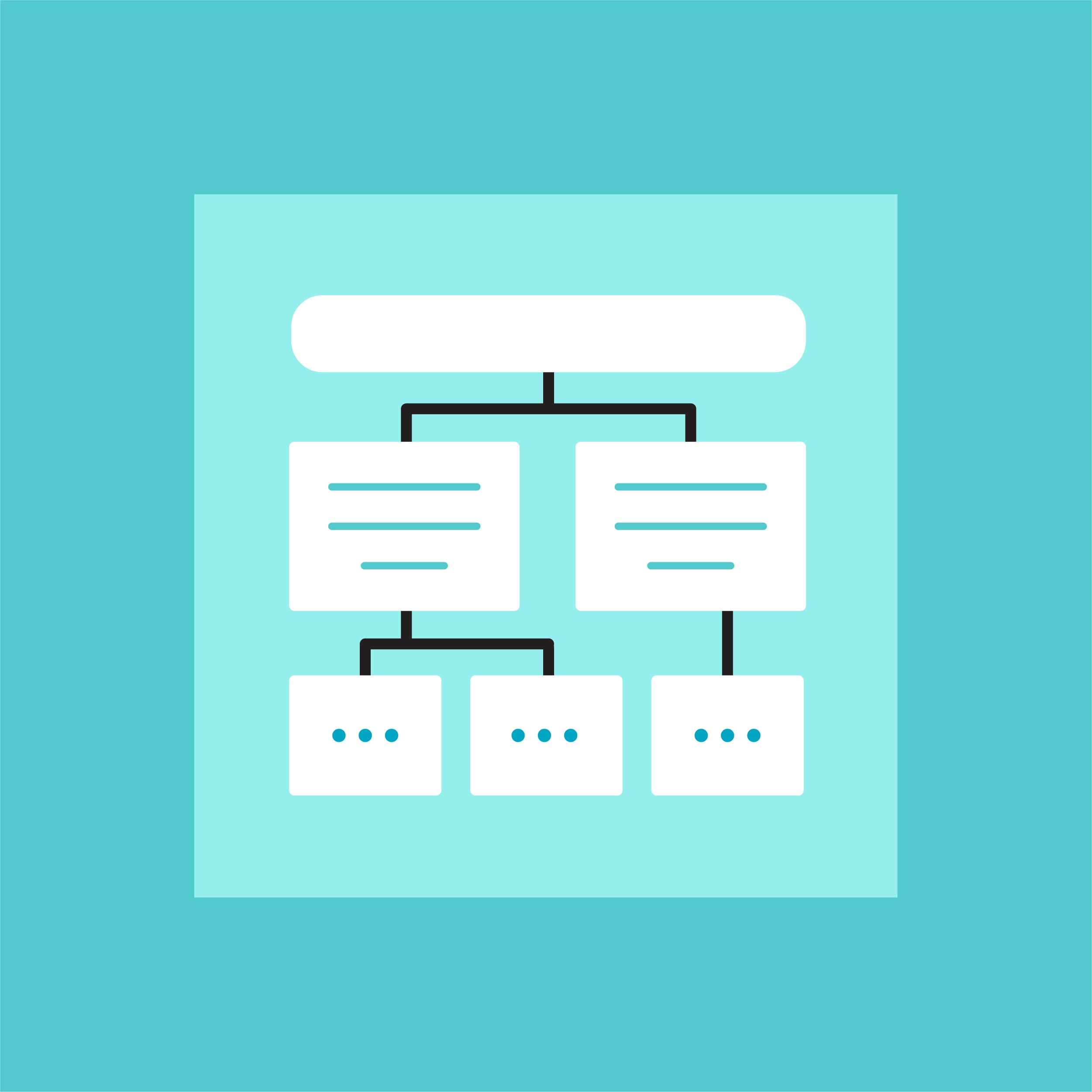
- The right side of the brain processes images, and the left side processes text. This means that the most efficient place to position graphics is in the users’ left visual field.
- We can help the user by grouping similar objects.
- Always opt for the simplest interpretation.
- Use continuous patterns. For example, for procedures, I start with a heading (H1), add an introductory paragraph, and then begin the procedure with a bolded statement, “To do something . . .” The steps follow as 1., 2., and 3.
- Consider the user’s threshold–meaning sensory filters. Do not overload the page with graphics.
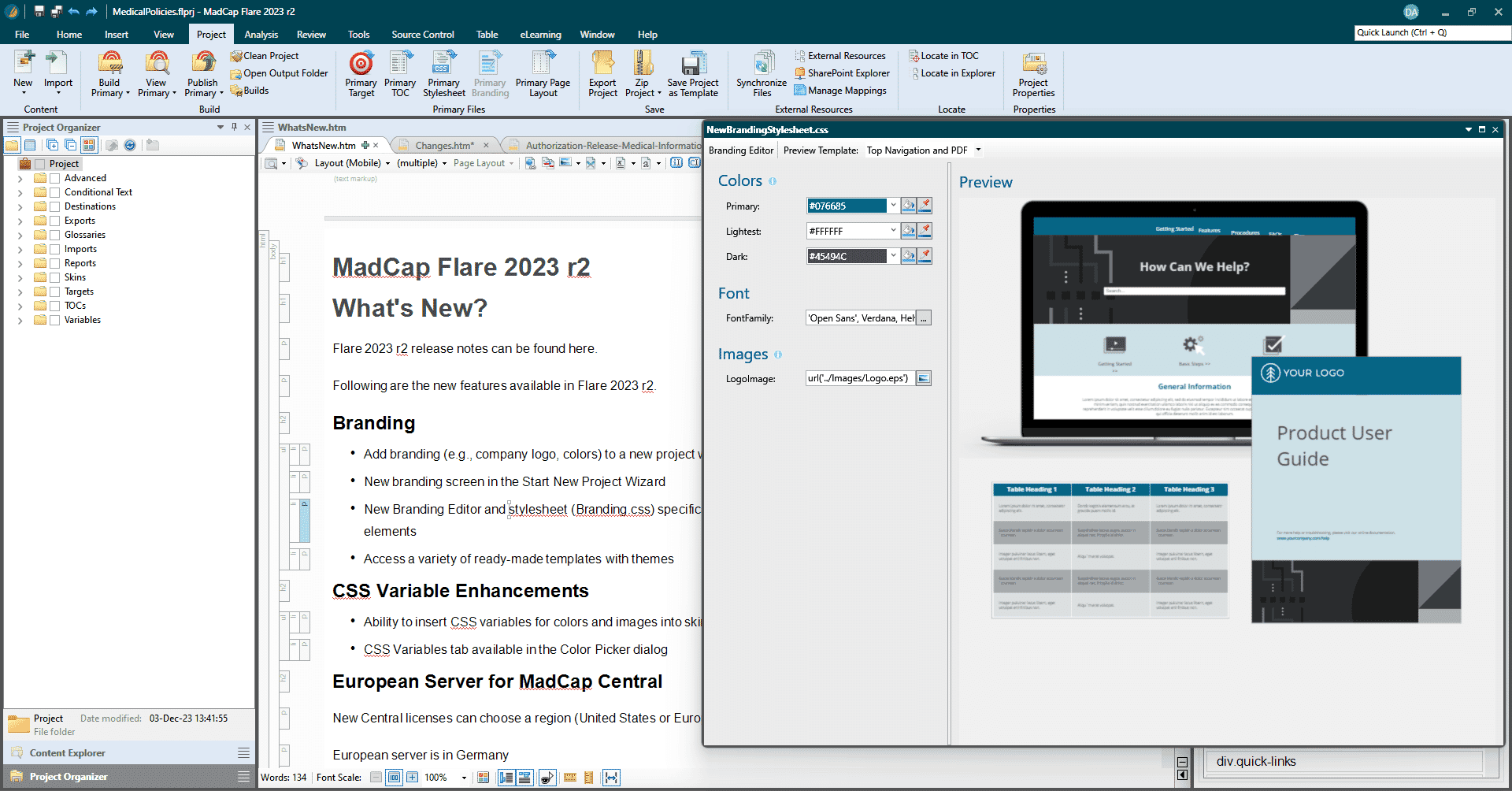
MadCap Flare significantly enhances document design by offering robust features like responsive design for your online formats, which ensures content is accessible and readable across various devices. Its topic-based authoring approach allows for more organized and manageable content, crucial for technical documentation. Flare's advanced styling and formatting capabilities, including the integration of visuals and text, facilitate the creation of documents that are not only informative but also visually appealing. This synergy of content and design is what you need throughout your document creation process.
Responsive Images and Graphics
Users store and retrieve information more easily when it is graphical (Coe, 1996). This is the graphic design philosophy you need to take into consideration when approaching document design.
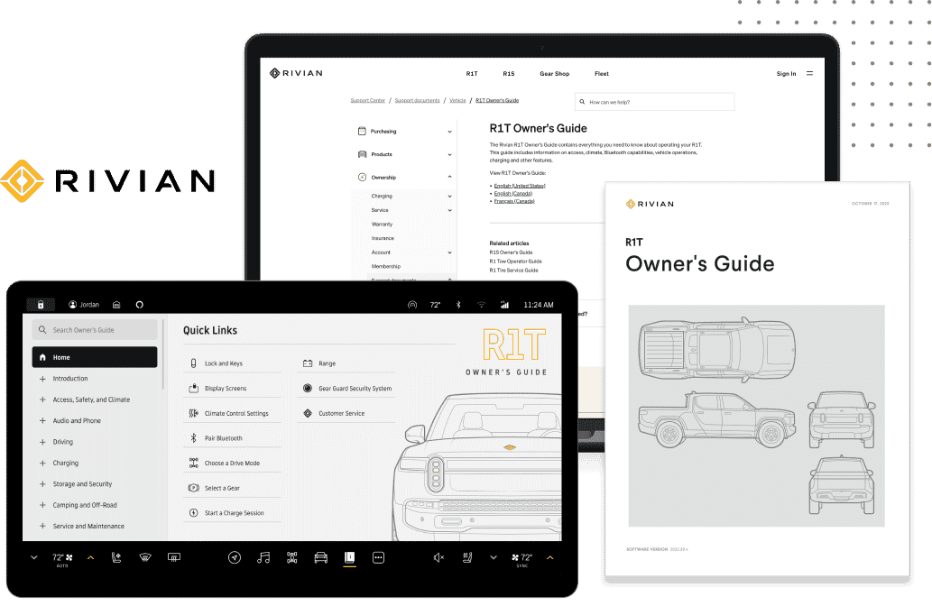
Consider adding a screenshot when documenting complex procedures. Screenshots are a guiding light and help the user confirm their place in the process. Entry-level users may find comfort when screenshots accompany a complex task. Graphical information, such as images, charts, and diagrams, are often easier to remember than text-based information. This is due to the pictorial superiority effect, where visuals are more likely to be encoded into long-term memory, making them more retrievable later.
Follow these guidelines for images and graphics:
- Prioritize responsive images that adapt across devices.
- Choose graphics that are meaningful and support the content.
- Use visuals sparingly for emphasis, not decoration.
- Place graphics in the left visual field to align with natural perception.
- Maintain balance and consistency in number and placement.Replace static screenshots with text-based instructions when possible to reduce clutter.
- Apply visual cues and proximity principles so graphics clearly connect to related text.
Other Factors to Consider in Document Design
Beyond typography, layout, and visuals, several psychological principles influence how readers perceive and process information. Keeping these in mind will make your documents more intuitive and user-friendly:
- Gestalt Principles – Readers naturally group elements, look for patterns, and prefer simplicity. Design with continuity, symmetry, and clarity in mind.
- Tables and Lists – Use structured formats to organize complex information. For example:
- Tables clarify relationships between data.
- Definition lists simplify field descriptions or actions.
- Hierarchy and Flow – Present information in logical steps (e.g., Step 1, Step 2, Step 3) and pair with supporting visuals when helpful.
- Proximity and Similarity – Keep related text and graphics close together so meaning is immediately clear.
- Cognitive Load – Avoid overwhelming users with too many visuals or cluttered layouts; simplicity supports understanding.
These principles guide how the eye and brain work together, helping readers absorb content more efficiently while making your documents approachable and engaging.

Bringing It All Together
Effective document design is about more than fonts, layouts, or visuals—it’s about creating content that is readable, accessible, and engaging for every user. Applying principles such as hierarchy, proximity, balance, and simplicity ensures that your documents not only look good but also effectively communicate.
Tools such as MadCap Flare make this process even more powerful by providing responsive design for multiple devices, topic-based authoring for organization, and advanced styling options that seamlessly integrate visuals with text. With the right combination of design best practices and modern tools, your documents become more than information—they become an experience that supports learning, usability, and long-term impact.
Resources
Coe, M. (1996). Human factors for technical communicators. New York, NY: Wiley Computer Publishing.
Schriver, K. A. (1997). Dynamics in document design. New York, NY: Wiley.
Schriver, K. A. (2016). Reading on the Web: Implications for Online Information Design. In P. C. Oven & C. Pozar (Eds)., On Information Design (pp. 111-136).


%20(1).png)